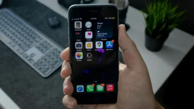
When your iPhone icons have unexpectedly become a bit blurred, don’t panic, it’s not your eyesight or a dirty screen. The new blurry look is part of the Apple Liquid Glass design language that was officially rolled out with iOS 26, iPadOS 26, macOS 26, and watchOS 26. The style, first seen in visionOS (2024), adds layers of transparency effects that make app icons and menus look like frosted glass.
The change of design is deliberate. Multi-layered, glass-like layers may cause the icons to appear slightly blurry or less clear than before. The Photos app is the best example of the use of overlapping translucent layers to create a blurred finish. Some users find it sleek and modern, but others see it as distracting, especially compared to the crisp look of iOS 18 icons.
During the iOS 26 beta testing period, Apple tried several Liquid Glass versions, and the final version is much more polished than the initial ones. However, the change has sparked mixed reactions, making it one of the most talked-about features in iOS 26. Luckily, Apple has provided some ways to tone down the effect if you do not like it.
How to Reduce the Blurry Effect on iPhone and iPad
Apple does not allow users to disable Liquid Glass and revert to the old design. However, you can make icons appear sharper by reducing transparency in the accessibility options. Here’s how you can do it.
- Open Settings.
- Go to Accessibility.

- Tap Display & Text Size

- Toggle Reduce Transparency to ON

For further customization, you can also try
- Increase Contrast – makes visuals stand out more
- Bold Text – enhances legibility
- Button Shapes – improves navigation cues
Try them out until you have a balance that works best for you.
New Icon Customization in iOS 26
Beyond accessibility tweaks, iOS 26 and iPadOS 26 also add a new method to uniformly style app icons. The users can now disable the icons’ color or assign them a consistent tint for a cleaner look:
- Go to your Home Screen
- Long-press until apps jiggle
- Tap Edit (top-left corner)
- Choose Customize
- Select Clear or Tinted to apply your preferred style.
Apple’s Liquid Glass design is a bold step toward a unified, modern outlook for all its devices. While it may take time to adjust, you do not need to live with icons that are too fuzzy. The new appearance can be flexible enough to be both useful and attractive with the appropriate settings and customization of iOS 26.


![how to make your tiktok account private]](https://wikitechlibrary.com/wp-content/uploads/2025/09/how-to-make-your-tiktok-account-private-390x220.webp)