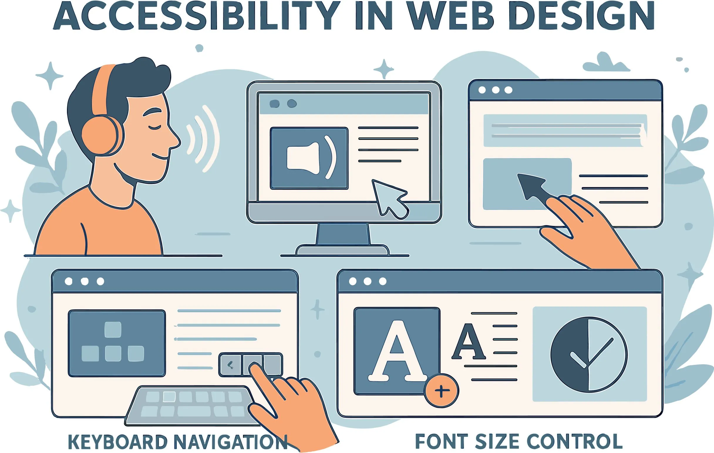
Americans with Disabilities Act (ADA) requires businesses and other organizations to give equal access to goods and services. These entail the internet sources, including mobile applications and websites. Such features and designs on your site must take into consideration people with disabilities; those who are visually impaired, those who are hearing impaired, and those who have mobility problems.
ADA compliance does not only refer to compliance with the laws. It also implies the establishment of a comfortable and non-dictatorial virtual space. ADA compliance does appear to be overwhelming when it comes to a wide variety of technical and design-related considerations. In this article, the nine-item guide on what you should have so that your website is compliant and inclusive will be discussed.


1. Provide Text Alternatives for Non-Text Content
When you are designing a website, you need to add images, icons,and charts, which are not written. These are vital in enhancing the look of the site and making it user-friendly. They are in cases where they are not tagged properly, they will be obstacles to visually impaired users.
Add meaningful alternative texts (alt text) when your non-text elements are not easy to consume. Those are words that characterize what a part plays in your site, so that screen readers can explain what they are and what they are about on the website.
An example is when you have the picture of a dog, you can insert the alt text as Chihuahua sitting at the front door.
When adding alt text to your content, make it descriptive and short. Never use more information than necessary and over-explain things.
An example of this is the use of decorative images with no added significant value to the text contents, where empty alt text is appropriate, such that screen readers will ignore such contents, and rather avoid distracting the user with useless information.
Mobility-impaired users tend to navigate the web using the keyboard rather than touching the mouse or the touchpad. All the features, including menus, links, and buttons, are available via use of keyboard navigation options.
It enhances ease of accessibility, whereby users are in a position to navigate through every component of the website via the keyboard with ease.
Make your site well-organized. The indicator highlighting the currently selected element should underline it and make it visible. Let me take an example, when you are tabbing through a form, there should be a clear indication of which field the user is currently on. It will ensure that the navigation is easier and that keyboard-reliant users are not confused.
There should also be consistent testing, preferably with those who need navigational support using the keyboard, so as to ensure that their needs are met.
Find roadblocks or anything that cannot be easily reached, test this with a mouse and without, and describe the differences, and make an accessible experience.
3. Ensure Readable and Resizable Text
Accessible texts that are readable and enlargable constitute an effective support of websites that are ADA compliant. The structure of the website must contain readable fonts that are easy to read. The fonts used must not be too ornamental or cursive since all this may harden the follow-through on the part of the user.
It enables one to resize its text in view of loss of functionality or readability easily because it has the option of zooming either in or out. One of the best methods of doing it is by employing relative units like percentages or ems rather than set pixel values.
Lastly, your text must please against the background so that people would not be fighting with glare. Collaborate with web development companies like Smartly Done, and so on to know accessibility since they will design a theme on colours that will be accessible.
The text also has to have a good color contrast ratio of not less than 4.5:1 to normal text and 3:1 text in large font.
4. Add Captions and Transcripts for Multimedia
Audio files and video clips are the cool features of any new-age website and stimulate interaction and increase traffic. It may be a challenge for users with hearing impairments in case they are not given the right captions.
Caption shows speech and other appropriate sounds in the form of text on the screen so that the viewers can read and watch simultaneously.
A written representation of any audio/video content is referred to as transcripts. They enable their users to get the information without tracing the sound or video. This is quite significant to those who are inclined to read and those with hearing disability or text-to-speech tools.
All words spoken, as well as a description of relevant non-verbal sounds, e.g., laughter, doorbell, etc., should be provided in transcripts.
While creating captions and transcripts, make them precise and close to what was mentioned in the content. This would be very crucial, and so when the speaker has a distinct accent, then it might breed errors in the process of captioning.

Navigation is the core component of web accessibility, as it determines how easily users can move between pages and read the web content. It must be understandable, comprehensible, and very predictable even to cognitively impaired users.
Begin by ensuring that your menus make sense, that they are labeled descriptively, that no elaborate pattern is required, and that there is keyboard access.
Secondly, your website should be designed consistently. As an example, suppose your navigation menu is at the top right part of your homepage; it should be in the same location on other pages. A structure that can be anticipated is simple to use and know your site.
To ensure consistency, your site must be like that on all pages. An example is that, when you have your main navigation menu positioned on the top of your home page, it needs to be in the same position on all other pages.
It also provides a good user experience since the users will not find it hard to move around your site, trying to find pages.
Also, a sitemap or a search should be incorporated to help users search for particular pages. The user who finds it difficult to use traditional navigation capabilities can enter a keyword in the bar and be redirected to where the content is. It is answering with a smooth interface, accessible, and user-friendly.
6. Avoiding Flashing Content
Blittering material, e.g., lights and other moving animations that pop on and off more than three times in one second, can be a really dangerous thing to impose on people who have photo-sensitive epilepsy.
They may cause epileptic fits and pain, which is not in line with the ADA compliance on web accessibility. To prevent such risks, make sure you thoroughly review your site for instances of flashing and/or strobing and eliminate them.
In designing transition animations, use low-key effects instead, because they avoid negative reactions and make the experience more agreeable. As an example, a smooth fade-in at a suggested flash eye-speed can be used instead of a lightning flash, suggesting a new message.
Make your animation with CSS transitions and transforms, which allow more control and visually easier transitions.
However, it is sometimes obligatory to stream flickering material in case you are rolling out seasonal deals like Christmas sales. In this kind of situation, incorporate a warning indication prior to the elements commencing to play.
It enables the users to judge whether or not to proceed with the interaction of your digital content. Make sure you always refer to the web content accessibility guidelines to keep your content at an acceptable rate to allow better user experience.
7. Offer Accessible Forms
Forms come in handy whenever obtaining contact details, making transactions, or subscribing to newsletters. But in case it is also not available in those forms, many people will not be in a position to complete it, and it may cost some leads or maybe business.
It also means that your website features do not pass the compatibility checklist and face the risk of disability discrimination.
Make your form inputs descriptive. Labels are used to explain the meaning of the field, e.g., the labels can be “Enter your email address” or “Select your date of birth.” Error messages as well as instructions need to be available, and the language used to explain the error and correct it should be simple and understandable. e.g., instead of telling the user that there is an invalid input, state what was wrong, like “You should enter a valid email address”.
Use visible focus indicators, such as using an outline of a different color as a focus indicator in the selected field. Such indicators can enhance web form accessibility and visibility. The indicators direct the use of the form, avoid frustration, and it is very simple to navigate through the form.
8. Use ARIA Roles Appropriately
Accessible Rich Internet Applications (ARIA) roles also can increase the accessibility of dynamic bit content, such as drop-down menus or sliders. The ARIA roles give extra information about the purpose of an element and help them to assistive technology, i.e, screen readers.
As an illustration, an ARIA role of button can make clear that an interactive component is touchable and that an aria-expanded= “true” may make known to a screen reader that a collapsible area is currently extended.
ARIA roles, however, are to be reserved and used only when a native HTML elements fail to implement a required functionality. Excessive use of ARIA roles will lead to accessibility problems because the latter convey duplicate and contradictory information to assistive technologies. Use semantic HTML where it is feasible, which is automatically more accessible.
9. Regularly Test for Accessibility
The process of turning your site into an accessible design and one that is inclusive is continuous, and there is always a way to make it better so as to address all the gaps in accessibility.
Check accessibility as a regular process according to ADA and WCAG, as content and technology change. Automation tools can show the problems of accessibility and correct them at the time speedily.
Another strategy is to perform a manual test to find more subtle problems, and in that case, you would involve the users with disabilities as your subjects for testing. Their feedback will aid in determining the obstacles they face daily, since not all of them may be detected by automated tools.
You are able to incorporate the two in order to achieve the optimal results and more thorough accessibility testing.
Conclusion
Designing an ADA accessible site is the chance to design a site that is inclusive to most of the users. Using this nine-item checklist, it is possible to create a well-accessible web that will give the users a superior experience. Begin with something small and test and audit frequently then make it better to become ADA compliant.