Investors, traders, and experts have always been interested in the stock market and wanted to understand how it moves. Every day, trillions of pounds change hands, affecting the world economy and the wealth of both people and businesses.
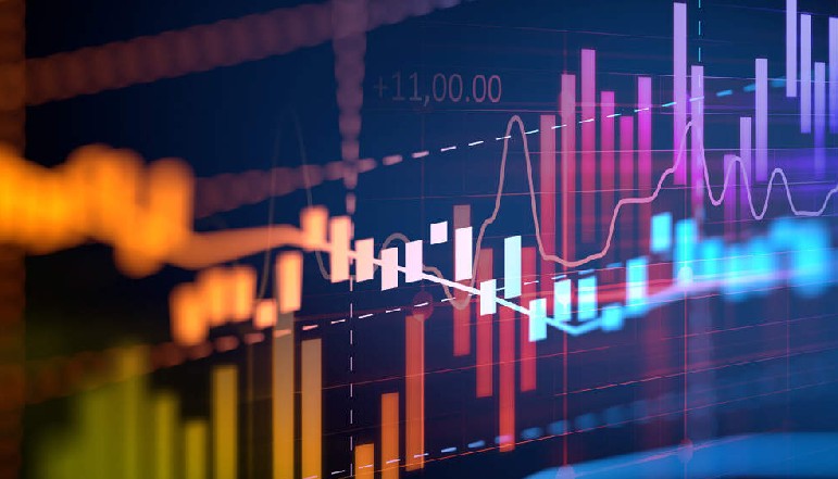
As the financial world becomes more complicated, how to make sense of so much information so quickly has become a question. It has become clear that data charts are one of the best ways to understand and predict future stock market trends.


These visual tools help to simplify the many market signs into forms that can be understood. This gives traders and decision-makers more confidence and clarity when they act.
Data charts have changed along with the markets they show, from the simple line graph to dynamic, AI-powered data analytics tools that give us insights that were almost unimaginable just a few decades ago.
Cloud computers, AI, and algorithmic trading are changing the way financial companies work, so data charts are more than just a pretty picture. They are very important to modern finance because they help everyone, no matter how big or small, find trends that can help them guess where the market is going.
No matter how experienced you are with charts or how new you are to them, being able to read and understand well-structured data charts is essential for smart business decisions. Once, strategic decisions were based on gut feelings and a few isolated data points.
These days, real-time, data-heavy assessments that rely on carefully chosen images are driving these decisions more and more. Even though markets will always be a little unpredictable, the rise of data charts has made decision-making much less based on guessing, bringing about a new era of rigorous analysis.
According to a developer from SciChart, when dealing with large-scale financial data sets, it’s crucial to rely on a robust JavaScript charting library, capable of handling high throughput and live updates.
Developers should seek platforms that offer stability, cross-platform compatibility, and real-time performance to ensure that end-users, be they professional traders or casual investors, have the best visual experience possible.
Below is an in-depth look at the evolution of stock market analysis, the role that data charts have played in that evolution, and how technology’s latest advances might reshape the way we trade, invest, and plan for the future.
The Evolution of Stock Market Analysis
Stock market analysis dates back centuries, to a time when individuals gathered around trading floors with clipboards, telegraph machines, and telephone wires. Before the advent of computers, price quotes were scribbled by hand, and brokers studied these numbers in ledger books.
The application of rudimentary charting methods was already in evidence, as traders painstakingly plotted price movements to detect shapes they believed would foretell market patterns.
Candlestick charts, for instance, have their roots in 18th-century Japan and were used to track the price of rice. Even then, investors recognised the importance of visual cues when evaluating complex markets.
As stock markets expanded in breadth, complexity, and volatility, new analytical approaches emerged. Technical analysis, with its focus on price trends and market indicators, gained traction in the early 20th century.
Data charts played a crucial part in this development, enabling traders to map out price fluctuations over days, weeks, and months. The concept of support and resistance levels, trendlines, and breakouts gained popularity, supported by the visuals that brought these concepts to life.
However, these techniques depended heavily on manual calculations, making them time-consuming and prone to human error.
The modern era of stock market analysis began with the proliferation of computers, which drastically reduced the time it took to gather, process, and display data. Early mainframes could calculate a myriad of financial metrics at speeds that were unprecedented, but the transition to personal computers propelled finance into a new dimension.
Personal computers running dedicated trading software allowed individuals to access near real-time data feeds. Suddenly, even retail traders could chart market movements second by second. This would make sophisticated analytical tools accessible to everyone by allowing the rapid overlay of technical indicators like Bollinger Bands, Relative Strength Index (RSI), and Moving Average Convergence Divergence (MACD) on price charts.
Simultaneously, computers allowed fundamental analysts to easily access company results, economic data, and news feeds, which aided their work.
This democratisation of technology spurred the development of online trading platforms that seamlessly integrated data charts, news feeds, and investment tools. As internet access expanded globally, geographical boundaries became less of an obstacle, creating a truly international marketplace where traders from anywhere could analyse and invest in any major stock exchange.
The globalisation and digitisation of financial markets set the stage for the next wave of charting technologies, wherein live updates, interactive features, and custom indicators became the norm rather than the exception.
Today, advanced charting libraries, real-time data streams, and APIs have created an ecosystem that redefines how we see and understand the stock market. This environment is fertile ground for the next step in the evolution of data charts, one that harnesses the power of cloud computing, artificial intelligence, and machine learning.
The Power of Data Visualisation in Forecasting
The main benefit of data visualisation is that it can turn numbers, which can be hard to understand, into pictures that are easy to understand. When it comes to the stock market, where prices can change a lot in an instant, data visualisation makes things clear right away by showing both short-term changes and long-term trends.
A normal trade day can produce a huge amount of data, from starting and ending prices to intraday highs, lows, and volumes. Looking for trends in many different factors is like looking for a needle in a haystack when you don’t have a visual lens.
One of the core strengths of data charts is that they allow traders to observe historical price movements in relation to current prices, thereby unveiling cycles or seasonality that might recur.
Price charts can be adjusted across different time intervals—from one-minute intervals for day traders seeking rapid movements to monthly intervals for long-term investors aiming to see macro-level patterns.
As the time horizons grow, the charts reveal narratives that can be fundamental to predicting future moves, providing data-driven insight rather than speculation.
Also, data representation fits right in with the new wave of machine learning tools that are being used in financial research. Structured data is needed for algorithmic models that look for small changes in prices or changes in volume.
The results of these models can be put on top of data charts to make alerts and labels that help traders find possible risks or opportunities.
For example, if a machine learning system finds a pattern that has always happened before a stock’s price goes up, that pattern can be instantly shown on the right chart, which immediately grabs the trader’s attention.
The ability of computer models and eye analysis to work together is one of the biggest improvements in forecasting accuracy in recent years.
Data representation has also become an important way to bring together experts and beginners. Beginners who don’t know a lot about how the stock market works can benefit from easy-to-understand graphics that condense thousands of data points into shapes and colours.
You can learn more about the market by using an interactive screen that lets you see changes in real time, instead of just depending on second-hand accounts or hard-to-understand jargon. Individual investors are becoming more powerful thanks to easy-to-use charting tools.
This could increase the number of people who participate in financial markets, which could change liquidity, volatility, and maybe even the general success of some stocks.
Real-time Charting Tools and Their Significance
While basic charts have been around for centuries, the drive toward real-time charting tools has transformed how both individual traders and institutions operate in today’s markets. Real-time data suggests that traders no longer need to rely on delayed prices and post-session analysis.
By watching price updates as they occur, market participants can respond instantly to breaking news, sudden price swings, or emergent patterns.
The velocity of modern high-frequency trading would be inconceivable without the capacity to rapidly visualise and interpret data feeds that stream live from stock exchanges.
Behind these tools, a complex infrastructure ensures that data is collected, cleaned, and delivered almost instantaneously. For a chart to update in real time, stock exchanges generate a constant feed of trades, each of which is timestamped, categorised, and transmitted across data centres.
These data packets must then be synthesised, sometimes with additional contextual information such as volume and order flow. All of this is done in a fraction of a second.
The charting tools that display this information must be capable of handling huge transaction volumes without crashing or lagging, a feat that requires robust server hardware, optimised algorithms, and efficient software frameworks.
Real-time tracking is important for more than just day traders and high-frequency trading companies. Long-term investors may also benefit from getting instant alerts when a certain stock hits a goal price or breaks through a key level of support or resistance.
Quick responses to market events, like a rapid drop caused by unexpected business news, can be very important for keeping gains or avoiding losses. Similarly, risk managers in bigger companies can learn a lot from real-time images.
These people are in charge of making sure that the firm’s investments stay within acceptable risk limits. Real-time charts help them spot possible problems early on.
Customisation is another important part of current real-time charts. Many users want to be able to change charts to fit their needs or plans. This could mean picking out certain time frames, labels, or signs. When traders use more advanced charting tools, they can add notes to charts and draw trendlines and important areas of interest.
If the base is flexible, it can be changed to better suit new tactics. Libraries that support dynamic and engaging interfaces, like those made with JavaScript charts, often have this kind of freedom.
These packages let developers add real-time features to web-based platforms, which means that these tools can be used on more devices and operating systems.
Emerging Technologies in Stock Market Predictions
A lot of new ideas are emerging in technology right now, and many of them are being used in banking services. These days, big data platforms can store and process terabytes or even petabytes of past market data, which is a great tool for quantitative researchers.
Using cloud computer services, like those from Amazon Web Services (AWS) and Microsoft Azure, can save you money and time compared to handling your own servers. Large institutions used to be the only ones who could do complex models, but now even small businesses can do it thanks to easy access to computer power.
Machine learning and artificial intelligence are two of the newest technologies that are changing how stock market predictions are made. Algorithms like recurrent neural networks (RNNs) and long short-term memory (LSTM) networks are great for predicting stock prices because they can work with time series data.
These computers sort through huge amounts of data, such as past price changes and basic signs, to find trends that a person might not be able to see.
There is some evidence that AI-driven technologies can make more accurate predictions than older methods, but they are still not perfect. This is especially true when real-time data sets are added to it.
Natural language processing (NLP) makes market research even more useful by pulling data from news stories, social media, and company records. Large merger announcements or the sudden departure of a CEO are two examples of events that can move the market.
These events usually first appear in writing or speech. NLP algorithms that have been taught to analyse sentiment can quickly tell if public opinion about a stock is leaning positive or negative. They can then use these insights to add sentiment signs to data charts.
When textual analysis and real-time data feeds are combined, they combine qualitative and numeric factors into a single framework that considers the whole picture.
The science behind blockchain is also important. Some people who are thinking ahead want to create tokenised versions of stocks that can be sold on open markets. This could lead to trade 24 hours a day, seven days a week, and automatic settlements.
This could change how the market works and create new kinds of data that can be analysed and charted. Blockchain-based financial goods are still new, but they are starting to show signs of a future where regular stocks, cryptocurrencies, and digital assets all work together.
As new technologies are constantly added to financial tools, the field of data charting remains flexible and able to adapt to new needs and developments.
Challenges in Data Charting and Interpretation
Even though data charts have some benefits, they also have some problems. At its core, a chart is just a picture of data from the past and present; it can’t promise that it will accurately predict what will happen in the future.
Sometimes, even the most powerful technical signs can’t predict sudden changes in the market caused by rare events. Black swan events, like natural disasters, pandemics, or global crises, can quickly throw off technical trends or make them look normal until they suddenly stop.
So, being careful and managing your risks are still very important, no matter how complicated or thorough a plan is.
Another problem in data analysis is overfitting. Traders who have access to strong tracking tools often test different indicators against past prices until they find the best-case scenario in which the indicators correctly predicted market highs and lows.
However, this could just be a chance that only happens in one sample. When the method is used in the real world, it might not work when new information comes in or the market changes.
There is a thin line between finding strong signs and basing too much of your strategy on past performance. If you’re not careful, data charts can sometimes lead you to the latter.
It’s also important that the data is correct. Real-time sources can have problems like delays, data spikes, or wrong prints. Traders can be fooled by these oddities if they aren’t carefully filtered. They can cause fake signals or sudden, unexplainable jumps in an indicator.
The fact that stock markets are global makes things even more complicated. Charting may not be the same in different parts of the world because different markets may have different rules for reports, trade halts, or data structures. It’s a big job to make sure that data sets are clean and uniform, but it’s what makes every image reliable.
The mindset of people adds even more complexity. A lot of people in the market read charts in ways that are consistent with their own views. For example, traders who are optimistic about a certain market might look for chart patterns that support their belief, while ignoring or downplaying signs that point to a downward trend.
If enough traders act on technical signs at the same time, they can easily become self-fulfilling predictions. This adds another layer of feedback loops that can make price changes bigger than what makes sense. Even though charts may show these effects, it is still hard to understand and lessen the effects of crowd behaviour.
The Impact of React, JavaScript, and Other Tools
Web-based solutions are becoming more and more important for making data analysis tools available to everyone, and frameworks like React are essential for making interfaces that are easy for people to use.
Because they are flexible and can be used on multiple platforms, JavaScript charts are widely used in both personal and business budgeting.
Brokerages and financial companies can make charting platforms that can be accessed from any device, like a desktop computer or a mobile phone, by using widely used technologies. This increased exposure makes users more involved, which in turn encourages more people to join the market.
The technology behind these tools is important, even though the term “JavaScript charts” is sometimes used as a catch-all. For computer graphics libraries to work, they need to be able to handle large amounts of data in real time.
This means they need fast methods for rendering and updating graphics without causing stutters or crashes. A lot of the time, developers also connect these charts to database management systems or data stores in the cloud.
By combining front-end frameworks with back-end services, powerful browser-based apps are made that can display complex charts in a way that was previously only possible on desktop computers.
Open-source groups are also very important. They allow writers to work together and share plugins, changes, and bug fixes, which keeps charting packages getting better.
With the help of easy-to-find documents and React charting components, even small-scale coders can add dynamic data charts to their products. This open approach to technology encourages new ideas and ensures that user experiences improve quickly.
In the future, combining JavaScript maps with augmented reality (AR) or virtual reality (VR) could lead to new ways of showing data. Imagine that financial experts were wearing AR glasses that showed a live chart of the market floating in the air along with news stories and mood indicators that were important to the market.
Even though this futuristic situation isn’t widespread yet, it shows how complex data can be made more real and involved in almost endless ways. It’s still too early to tell if these kinds of solutions will become common, but the technology is definitely being built for them.
The Future Outlook and Conclusion
As the financial markets continue to grow thanks to new technologies and the spread of trade, data charts are the most important analysis tools that can be used.
They turn huge amounts of data into easy-to-understand graphics that help traders, researchers, and regular users deal with uncertainty in a more organised way.
There is always some risk, but with today’s charting and data analysis tools, you can avoid guessing that isn’t necessary and find chances that you might not have seen otherwise.
How we understand financial data will change even more dramatically over the next ten years. Soon, real-time data will be able to work more always and faster. Software will use artificial intelligence (AI) more and more to find secret connections, adding advanced computing power to human intuition.
Market data won’t just be stock prices; it will probably include a lot of different digital assets and swaps, all of which will need their own unique ways to be analysed and shown.
As we move towards blockchain technology, there may be decentralised trade that goes on all the time. This will put more stress on tracking systems, which will have to adapt to a constant flow of data.
On top of these developments, user-centred design is becoming a priority for financial software providers. Simplicity, intuitive navigation, and rich interaction will become non-negotiable, allowing both experienced traders and newcomers to access analytics that offer real value.
If the current trend holds, web-based platforms leveraging React and other powerful frameworks will play an even larger role in delivering sophisticated data charts.
Whether viewed on a large workstation monitor, a tablet, or even virtual reality goggles, the future is likely to bring an abundance of flexible, immersive charting solutions.
When thinking about how the stock market will change in the future, it’s important to remember that markets are more linked, data-driven, and technologically complicated than ever.
Traditional ways of analysis are still useful, but they need to change quickly to keep up with real-time data feeds, AI-driven insights, and investors from all over the world. These days, data charts are one of the most useful tools we have access to.
They help us understand basic data and turn it into useful insights. Their level of intelligence will only grow over time, which could lead to new and more accurate ways of predicting how the market will change.
In the end, being able to chart and understand huge amounts of data in real time may be the thing that sets successful market players apart from those who fall behind. Still, it’s important to be careful, follow the rules, and have a basic idea of how the economy works.
Not even the best technology can completely predict the future. However, market players have a better chance of navigating the challenges that lie ahead if they have the best charting tools and a disciplined attitude.
Data charts will be an important part of the financial markets for years, if not generations, to come because they combine the power of modern computers with the need to see and understand information.