
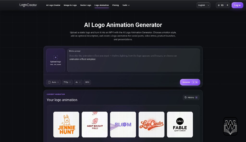
Motion can make a familiar mark feel newly alive, but movement alone does not create a useful identity asset. A spinning symbol, dramatic reveal, or elastic wordmark may attract attention once and still fail to support the brand in daily use. The strongest logo animation grows from the logic already present in the static mark: its shape, rhythm, spacing, and tone.
For a small team preparing a launch, social campaign, or event, the goal is to define a repeatable motion behavior rather than add a decorative effect. A well-planned logo animation should be recognizable without sound, flexible across formats, and brief enough to respect the viewer’s time. Testing it in the places where it will actually appear is the fastest way to separate brand behavior from visual novelty.
- Translate Static Design Traits Into Motion
- Find the Natural Movement Inside the Mark
- Decide What the Motion Must Communicate
- Test the Launch Environment First
- Build Versions for Different Editing Needs
- Adapt the System for Social Video
- Protect Legibility on Small Mobile Screens
- Scale the Motion for Event Screens
- Document a Reusable Motion Signature
Translate Static Design Traits Into Motion
Begin by naming what makes the logo itself distinctive. A geometric mark may rely on pieces locking together. A handwritten wordmark may communicate through flowing strokes. A bold monogram may feel powerful because of its weight and sharp direction. These traits are useful raw material for logo animation because they provide a reason for each movement.
Avoid choosing an effect simply because it is available. A soft, gradual reveal can weaken a brand built around speed, while an aggressive bounce can undermine a calm professional identity. Write three motion adjectives that match the brand, such as precise, warm, energetic, restrained, playful, or assured. Then judge every AI logo animation choice against them.
Find the Natural Movement Inside the Mark
Look for implied direction. Diagonal shapes can enter along their own angle. Repeated elements can appear in sequence. Negative space can open as pieces separate. A letterform can draw itself when stroke order feels natural. This produces logo animation that appears connected to the mark instead of placed on top of it.
Create a rough AI logo animation storyboard with a start frame, one or two key transitions, and a settled end frame. The final frame should match the approved static logo exactly. That rule protects consistency and gives editors a clean place to hold the mark after the movement ends.
Decide What the Motion Must Communicate
AI logo animation can clarify a concept, signal a product quality, or create a recognizable introduction. It should not attempt all three at once. A collaboration product might use separate forms joining into one. A creator tool might show a simple transformation from raw shape to finished mark. A service built around reliability might use controlled alignment rather than chaotic assembly.
When the purpose is clear, logo animation becomes easier to review. The team can ask whether the sequence communicates the intended behavior rather than arguing about which effect feels more exciting.
Test the Launch Environment First
A launch video often gives the logo a prominent final moment, but that does not justify a long sequence. Viewers may already have watched product footage, testimonials, and a callout before the closing mark appears. A concise logo animation usually works better because it delivers recognition without slowing the ending.
Place the AI logo animation draft directly into the launch edit. Check whether its pace fits the surrounding cuts and whether the final frame remains long enough to register. Test it with sound muted. If the motion depends on a musical hit to make sense, the visual sequence may need a clearer internal rhythm.
Build Versions for Different Editing Needs
Editors need more than one export. Prepare a standard version, a faster cut, and a static end card. If the logo animation has a transparent background, also test it over light, dark, and visually busy footage. Thin details and subtle color changes can disappear when placed over real scenes.
Keep the central movement consistent across versions. Timing may change, but the mark should not behave like a different personality in every edit. Repetition is how motion becomes part of recognition.
Adapt the System for Social Video
Social platforms reward immediate clarity. A long animated introduction can feel like an obstacle before the content begins, especially on vertical video. In many cases, the best use of logo animation is a short closing signature, a compact transition, or a subtle corner treatment rather than a full opening sequence.
Test the design in vertical, square, and horizontal frames. A movement that travels widely across a landscape canvas may be cropped in a vertical composition. Centered motion is often more adaptable, but it still needs safe margins for platform interfaces and captions.
Protect Legibility on Small Mobile Screens
Review the logo animation on an actual phone at normal brightness. Fine particles, hairline strokes, and low-contrast gradients may look polished on a desktop and vanish on mobile. Simplify the sequence until the key transformation remains clear at the smallest likely viewing size.
Also inspect the first and last frames as still images. Autoplay, connection speed, or a viewer’s scroll behavior can expose only a fragment of the movement. Both frames should feel intentional, and the final state should remain readable even when the animation is seen only once.
Scale the Motion for Event Screens
Event displays introduce the opposite problem: enormous scale. Small imperfections become visible, and slow movement can feel even slower across a wide stage screen. The audience may view the mark from an angle or at a distance, so silhouette and contrast become more important than intricate detail.
Run the logo animation at the exact aspect ratio of the venue display when possible. Ask whether the movement remains balanced on a very wide canvas and whether the important action stays within the central viewing area. Avoid rapid flashes or transitions that become uncomfortable at large scale.
Events also involve technical uncertainty. Prepare a high-quality master, a lighter backup file, and a static fallback. Confirm the frame rate, background color, and looping behavior with the production team. A robust identity system accounts for playback failure without leaving an empty screen.
Logo animation should express one clear behavior. Logo animation should remain readable without sound. Logo animation should end on a faithful static mark.
Document a Reusable Motion Signature
Once testing reveals the strongest sequence, capture the rules behind it. Note the duration range, order of movement, easing character, approved background treatments, and required final-frame hold. Identify which elements may be shortened and which must never be changed.
This small motion guide keeps future logo animation consistent across launch assets, tutorials, paid media, and event graphics. It also helps external editors avoid adding unrelated spins, glitches, or transitions that dilute the brand. Store the original project, master exports, transparent version, and static fallback together with clear names.
The most effective motion identity does not demand attention through complexity. It earns recognition through a repeated behavior that feels true to the static design. When teams translate existing visual traits into movement, test real publishing environments, and preserve a clear motion signature, logo animation becomes more than a one-time flourish. It becomes a practical brand asset that can close a product film, sign a social post, and command an event screen while still feeling unmistakably like the same company.


A little discussion goes a long way.
Ask a question, share your experience, or help someone find an answer.
There is room for your perspective.
No discussions match this view yet.
Your voice belongs here
Keep it useful. Keep it kind.