
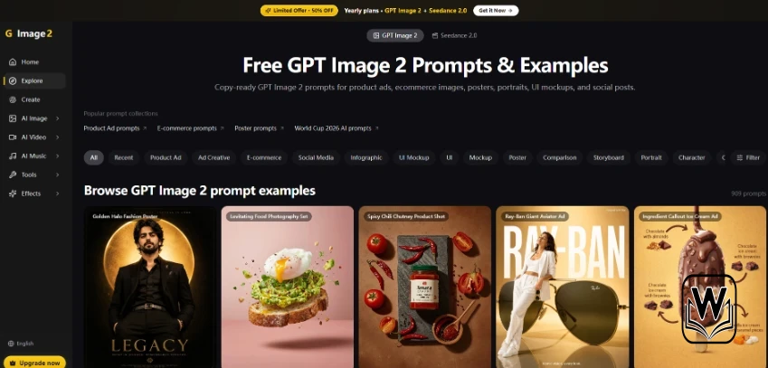
SaaS and education teams keep shipping “data” posters that look polished until a reviewer checks the source sheet. A bar is taller. A percentage drifted. A recipe yield changed for the sake of a prettier layout. That is not a design fail. It is a trust fail. More content leads are testing a reasoning-grounded path inside Image 2 instead of treating every chart as disposable decoration.
Image 2 positions itself as an independent image and video workspace powered by GPT Image 2 and other frontier models. One homepage claim matters for this article: turning live data, recipes, and knowledge into diagrams and infographics. The working question is blunt. Can a diagram stay honest when the art direction gets loud?
- Where Pretty Charts Quietly Break Trust
- Old Rescue Loops That Still Leak Accuracy
- What A Reasoning Grounded Path Changes
- Controls That Keep The Brief Honest
- Where Edits Belong After The First Draft
- A Pass Fail Board For Data Heavy Creatives
- Team Rules That Protect The Spreadsheet
- When Motion Should Stay Offline For Now
- Where This Path Still Needs Care
- Worth A Trial For Teams That Publish Metrics
Where Pretty Charts Quietly Break Trust
Marketing likes clean geometry. Analysts like numbers that match the spreadsheet. Those goals collide when a model treats figures as style tokens. Readers may not notice. Legal, sales engineers, and teachers will.
The damage shows up in three places. Investor one-pagers that misstate growth. Course slides that invent a weekly schedule. Product pages that “simplify” a pricing tier into something the checkout page does not sell. A beautiful wrong number travels farther than a plain correct table.
- Axis labels that round until the story flips
- Icons that imply categories the dataset never had
- Callout percentages that do not exist in the source
- Recipe or process steps reordered for composition
Old Rescue Loops That Still Leak Accuracy
Teams usually screenshot a real chart from Sheets or BI, then ask an image model to restyle it. The restyle is where numbers die. Another loop is typing the figures into a long prompt and hoping the model reprints them. Sometimes it does. Often it “improves” them.
Designers then rebuild the graphic by hand. That works for one hero asset. It collapses when localization needs five language variants of the same diagram, or when the dataset updates every Monday. You end up with an art queue guarding arithmetic.
Stock template packs are not safer. They encourage fake sample data that later gets mistaken for live metrics. Once that file hits a sales deck, the cleanup is political, not creative.
What A Reasoning Grounded Path Changes
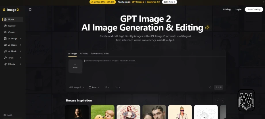
On the homepage, GPT Image 2 is framed for high-fidelity generation and editing, including reasoning-grounded visuals for diagrams and infographics. The practical shift is attitude: treat numbers as locks, not as decoration. GPT Image 2 also supports generate-and-edit in one model, so a wrong callout can be masked instead of regenerating the whole board.
Controls That Keep The Brief Honest
You still start from text, a reference image, or both. Then you dial aspect ratio and, when needed, edit masks. Resolution can go to 1K, 2K, or 4K. For diagrams, higher resolution helps tiny labels stay readable, but it will not save invented math.
Inputs That Belong In The First Prompt
- Paste the exact figures you will defend in review
- Name units, date range, and what must not change
- Attach a source screenshot as a reference when the layout is complex
- Ask for a clean chart hierarchy before decorative flourishes
Free signup includes up to 2 registration credits with no card required. That is enough to test whether your numbers survive a restyle. It is not enough to rebuild a full quarterly report pack.
Where Edits Belong After The First Draft
If only one label is wrong, brush that region with inpaint or object tools instead of rolling a new composition. Image 2 keeps background change, object remove, extend, upscale, and remove-background beside the generator, which matters when a diagram is almost right.
Cleared Images Kept As The Review Trail
Outputs land in My Images with downloads, favorites, and credit tracking. Keep the source sheet link in the filename or a sibling note. Reviewers should open number and graphic together, not three tabs later.
A Pass Fail Board For Data Heavy Creatives
Run five real assets: one growth chart, one process diagram, one pricing comparison, one recipe or schedule, one multilingual captioned poster. Approve only if every digit matches the source at 100% zoom.
| Check | Pass | Fail |
| Digits | Match the source sheet exactly | Rounded or invented values |
| Units and dates | Visible and correct | Missing or swapped |
| Category labels | Same names as the dataset | Pretty synonyms that change meaning |
| Edit cost | One mask fix clears the miss | Full rerolls still invent numbers |
Use the table in stakeholder review. If digits fail, stop debating color palettes.
Team Rules That Protect The Spreadsheet
Assign one owner for source-of-truth numbers. Designers decorate. They do not improvise metrics. When localization starts, translate labels only after the English diagram is locked. GPT Image 2 is positioned for crisp multilingual lettering up to 4K, which helps captions, but humans still own the arithmetic check.
When Motion Should Stay Offline For Now
The wider workspace can move into text-to-video, image-to-video, and reference-to-video, including Seedance 2.0 and Veo 3.1 paths. Animate a diagram only after the static version passes the number board. Motion that hides a wrong percentage is worse than a static miss.
Keep a red-team habit: one person tries to break the graphic using only the source sheet. If they find a mismatch in under two minutes, the asset is not ready for a public URL.
For recurring weekly metrics, store a prompt skeleton with locked number slots. Swap values carefully. Do not rewrite the whole art direction every Monday unless the story genuinely changed.
When stakeholders ask for “more premium,” separate decoration from data. Gradients and paper textures are fair game. Changing a 12% into an 18% for balance is not.
If you localize, freeze the English number layer first. Then translate surrounding labels. Mixing both changes at once is how a correct chart becomes a stylish lie in another language.
Where This Path Still Needs Care
Reasoning-grounded generation does not replace a spreadsheet. Fuzzy prompts still invite decorative math. If your source is messy, clean the sheet first. Image tools amplify clarity. They do not invent trustworthy accounting.
Starter around $7.99 per month is enough to diary a few diagram variants once the free credits are gone. Jump to Pro or Studio only when approved weekly volume proves the bigger pools.
Keep explore renders out of the metrics folder. A stylish wrong chart is more dangerous than an ugly draft because it looks ready to publish.
Worth A Trial For Teams That Publish Metrics
If your pain is diagrams that look premium while drifting off the data, Image 2 is a sane place to test GPT Image 2 on real sheets before you rebuild another multi-app restyle loop. Skip it when you have no numbers to defend and only want moodboards. Paid Starter, Pro, and Studio plans scale credits with unused pools that roll over once volume is proven.



A little discussion goes a long way.
Ask a question, share your experience, or help someone find an answer.
There is room for your perspective.
No discussions match this view yet.
Your voice belongs here
Keep it useful. Keep it kind.