
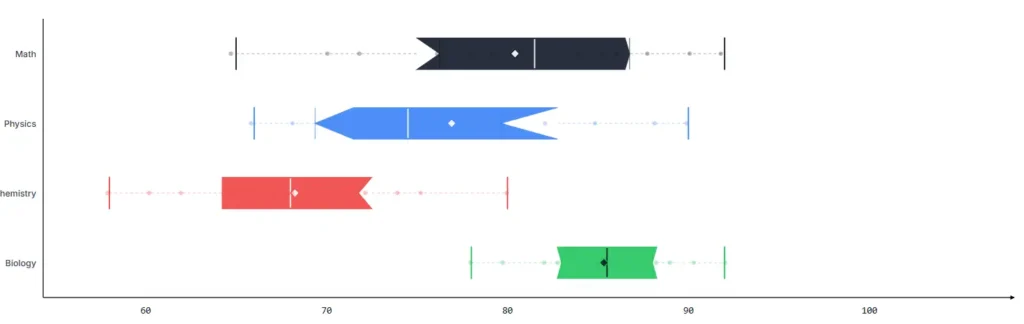
If you’ve ever tried to make a box plot in Excel, you know the pain. Five manual quartile calculations. A chart type that barely supports whiskers. No outlier detection. No notched boxes. No significance testing.
Here’s what a free online box plot tool does that Excel can’t, and why it matters for your workflow.
The Five Things Excel Gets Wrong About Box Plots
1. Quartile Calculation Is Your Problem
Excel’s box plot feature expects you to pre-compute Q1, median, and Q3 yourself. If you use the wrong method (and there are 9 valid methods), your entire chart shifts. A statistical box plot maker computes everything automatically using linear interpolation, so your quartiles are always correct.
2. Outliers Are Invisible
Excel won’t flag outliers for you. You need to manually apply Tukey’s fences (Q1 − 1.5×IQR, Q3 + 1.5×IQR), filter your data, and plot the outliers separately. This tool does it automatically and draws them as distinct circles on the chart. You can even adjust the sensitivity multiplier, 1.5 for standard detection, 2.0 for conservative, 3.0 for extreme outliers only.
3. No Statistical Testing
Comparing two groups? Excel won’t tell you if the difference is statistically significant. This interactive box plot generator runs Welch’s t-test and Mann-Whitney U tests on every pair of datasets and displays p-values, significance stars, and Cohen’s d effect sizes. The kind of analysis that normally requires SPSS.
4. One Chart Type, No Overlays
Excel gives you a box. That’s it. This tool lets you layer on Jitter scatter (every data point visible), Beeswarm (non-overlapping dot arrangement), Violin overlay (density distribution shape), KDE curves, and Raincloud plots, all on the same chart. Each overlay reveals a different dimension of your data.
5. Export Is a Screenshot
Excel’s chart export is whatever your screen resolution allows. This data visualization web app exports at 2x PNG resolution, pure SVG vector graphics for publications, and standalone HTML reports. No watermarks, no quality loss.
The Real Workflow Comparison
| Task | Excel | This Tool |
| Create a box plot for one dataset | ~10 minutes | ~5 seconds |
| Compare 5 groups side by side | ~30 minutes | ~5 seconds |
| Add notched 95% CI whiskers | Not supported | One click |
| Run pairwise significance tests | Requires SPSS or R | Automatic |
| Export for publication | Screenshot | SVG vector export |
| Overlay raw data points | Manual scatter plot overlay | One-click Beeswarm |
When to Switch
If you make one box plot a month, Excel is fine. If you make box plots regularly, for coursework, research, client reports, or internal analysis, the time savings alone justify the switch.
Start using the free box plot generator at aiboxplot.com, no sign-up, runs in your browser, your data stays private.




A little discussion goes a long way.
Ask a question, share your experience, or help someone find an answer.
There is room for your perspective.
No discussions match this view yet.
Your voice belongs here
Keep it useful. Keep it kind.