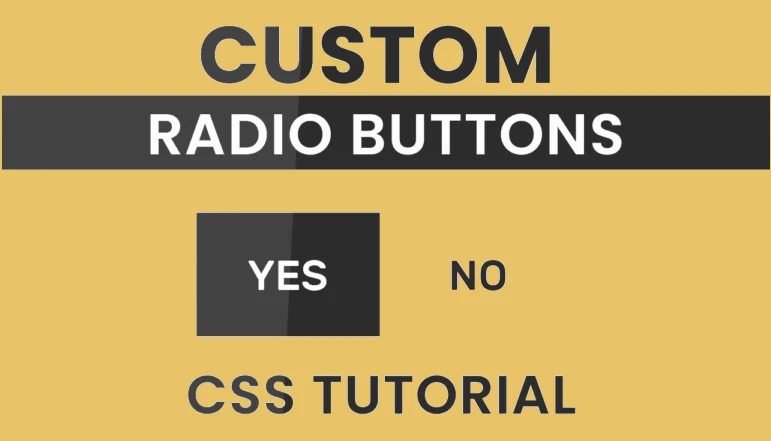
Disappointed with the radio buttons’ usual appearance? And you looking for a custom radio button to complement your user interface or website’s visual style? If so, you’ve found the right guide! To make radio inputs seem good in CSS, you need to do more than just change their background color and border width.
There are a few different methods that have emerged to style these radio buttons, but they’re all very difficult. Here we won’t need any fancy techniques or graphics to make a unique checkbox that fits your needs exactly. Just use plain old CSS and you’re good to go. Here, the ‘labels’ and ‘:checked’ selectors will be used as a useful little trick.
Let’s get started with the HTML portion of our guide right now. To start, we’ll make a box to enclose and centrally locate our radio inputs. In the following step, we’ll make two inputs called “radio” for our radio. Keep in mind that the names of the radio buttons must match.
HTML Code
The next step is to give each of these radio inputs a label. Using the identifiers, we connect the inputs to their respective labels. Two labels are generated, label for=’opt1′ and label for=’opt2′. In this case, we’re making a YES/NO radio button, therefore let’s put the words “Yes” and “No” within a span element for the labels.
<div class="container">
   <input type="radio" name="radio" id="opt1">
   <label for="opt1" class="label1">
       <span>YES</span>
   </label>
   <input type="radio" name="radio" id="opt2">
   <label for="opt2" class="label2">
       <span>NO</span>
   </label>
</div>
CSS Code
Centering The Container
To get started with CSS, we must first remove the default padding and margin from the content by setting them to 0. We then use the hex code #f5f5f5 to fill the rest of the page with a soothing off-white hue. Flex layout is being used to concentrate our container in this example.
body {
   background-color: #f5f5f5;
   padding: 0;
   margin: 0;
   height:100vh;
   width: 100vw;
   display: flex;
   justify-content: center;
   align-items: center;
}
Styling The Container
The next step is to provide the container’s dimensions: 260px*90px. So that the container looks to be floating above the ground, we give it a very slight box shadow.
.container {
   background-color: white;
   height: 90px;
   width: 260px;
   position: absolute;
   box-shadow: 0 0 30px 0px #d1d1d1;
   overflow: hidden;
}
Hiding Radio Inputs
First and foremost, we need to ensure that our radio buttons for default input are set to display none.
input[type="radio"] {
   display: none;
}
Styling Labels
We need to add labels on these previously hidden radio buttons. We need to specify a width and height for labels to do this. Please keep in mind that the height of our labels should be precise twice the height of the container when we are making those adjustments. Labels should also be exactly half as wide as their respective containers. These labels will serve as radio buttons from now on.
We have decided to go with a solid linear gradient made up of the colors #ffffff and #2c2c2c as the background image. The gradient’s direction is chosen from top to bottom. Since the height of the backdrop is now equal to that of the container, it appears to be spilling out of its containers. In this case, we need to hide the container’s overflow. Because of the overflow background has disappeared.
To ensure that the labels transition properly, we set it to 0.5 seconds.
.label1,.label2 {
   display: block;
   height: 180px;
   width: 130px;
   background-size: 130px 180px;
   background:linear-gradient(
	   to bottom,
	   white 0,white 90px,
 	   #2c2c2c 90px, #2c2c2c 180px
	   );
   position: absolute;
   top:0;
   transition: 0.5s;
   color: #2c2c2c;
}
Positioning Labels
Position this ‘No’ option to the right side of container by setting the right property to 0. Keep in mind that absolute position is being used here.
.label2 {
   right: 0;
}
Basic Typography
Make both span elements appear better by applying some simple typography styling. The flex property is used once more to center the span element’s content.
span {
   display: flex;
   height: 90px;
   width: 130px;
   justify-content: center;
   align-items: center;
   font-family: 'Rubik',sans-serif;
   font-weight: 500;
   font-size: 22px;
}
Styling for ‘:checked’ state
Finally, when a user selects an input, we utilize the ‘input: checked + label’ selector to highlight the adjacent label element. When the user selects a label, the related radio button is checked. We moved the labels’ background position up 90px to make the checked labels seem highlighted in black (#2c2c2c). Finally, we’ll change the font color to white.
input:checked + label {
   background-position: 0 -90px;
   color: white;
   transition: 1s;
}
After this, there will be no further tutorials. I’m hoping you’ve acquired some comfort with changing the appearance of radio buttons to meet your requirements.


